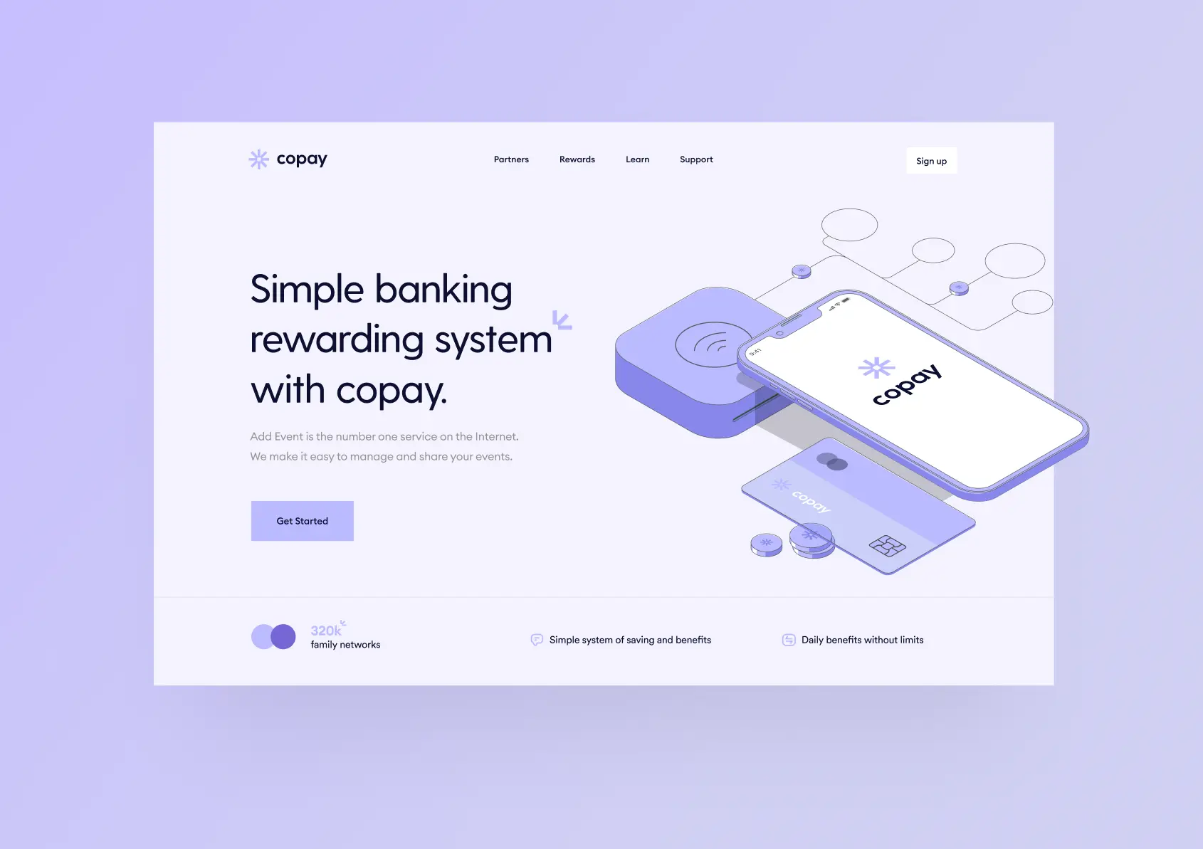
Copay System
Simple Banking Rewarding System
Unlock the future of seamless banking with Copay, where user experience meets unparalleled rewards. Our cutting-edge UX/UI digital project redefines the banking landscape, making every interaction effortless and every transaction rewarding.
Client
Copay Bank
Industries
Banking
Date
January 2023
Challenges
Ensuring design consistency across a large design team while navigating conflicting requirements from multiple product owners.
Objectives
Body 2
Impact
Improved design consistency and reduced inconsistencies by 54.55% across 8 banking services.
Challenges
Ensuring design consistency across a large design team while navigating conflicting requirements from multiple product owners.
Objectives
Body 2
Impact
Improved design consistency and reduced inconsistencies by 54.55% across 8 banking services.
Challenges
Ensuring design consistency across a large design team while navigating conflicting requirements from multiple product owners.
Objectives
Body 2
Impact
Improved design consistency and reduced inconsistencies by 54.55% across 8 banking services.
The problem
testing

The problem
testing
The problem
testing
To ensure design consistency across a large design team while navigating conflicting requirements from multiple product owners.
Our goal
To ensure design consistency across a large design team while navigating conflicting requirements from multiple product owners.
Our goal
To ensure design consistency across a large design team while navigating conflicting requirements from multiple product owners.
Our goal

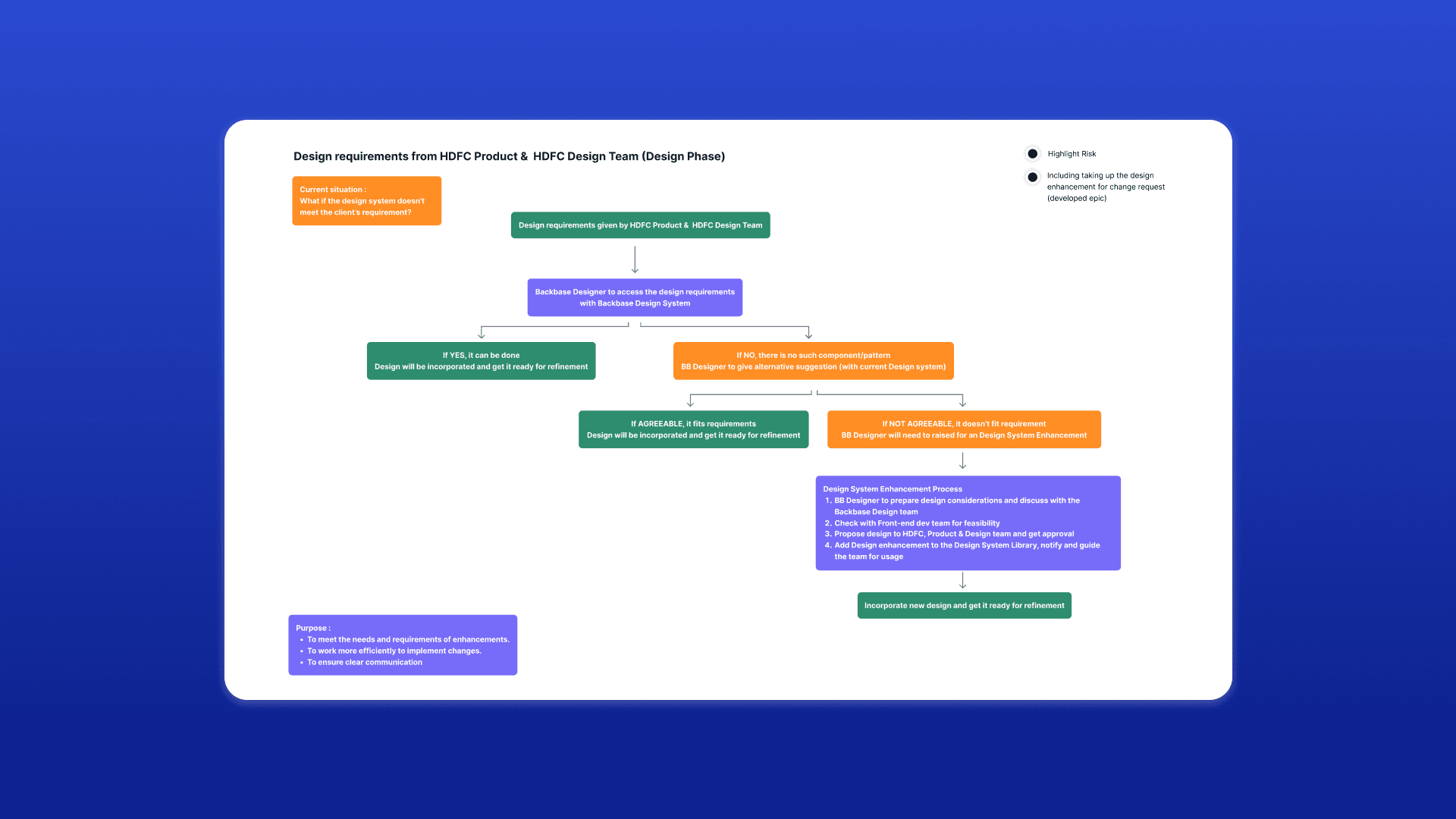
Discovery
First identifying and creating Design Patterns
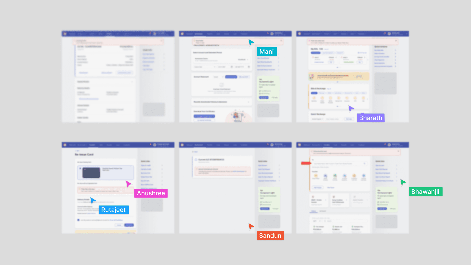
To identify common components used by the team, we gathered screens from various journeys. For instance, there were inconsistencies in the usage of Alerts, Error, and Success components due to the lack of proper guidance or existing components not fitting journey requirements.
Discovery
First identifying and creating Design Patterns
To identify common components used by the team, we gathered screens from various journeys. For instance, there were inconsistencies in the usage of Alerts, Error, and Success components due to the lack of proper guidance or existing components not fitting journey requirements.
Understanding design constraints in the system
I gathered the team to delve into their experiences to uncover specific challenges they faced when applying existing components. By understanding these challenges and the adaptations they made, we can better guide improvements.
Understanding design constraints in the system
I gathered the team to delve into their experiences to uncover specific challenges they faced when applying existing components. By understanding these challenges and the adaptations they made, we can better guide improvements.
Understanding design constraints in the system
I gathered the team to delve into their experiences to uncover specific challenges they faced when applying existing components. By understanding these challenges and the adaptations they made, we can better guide improvements.
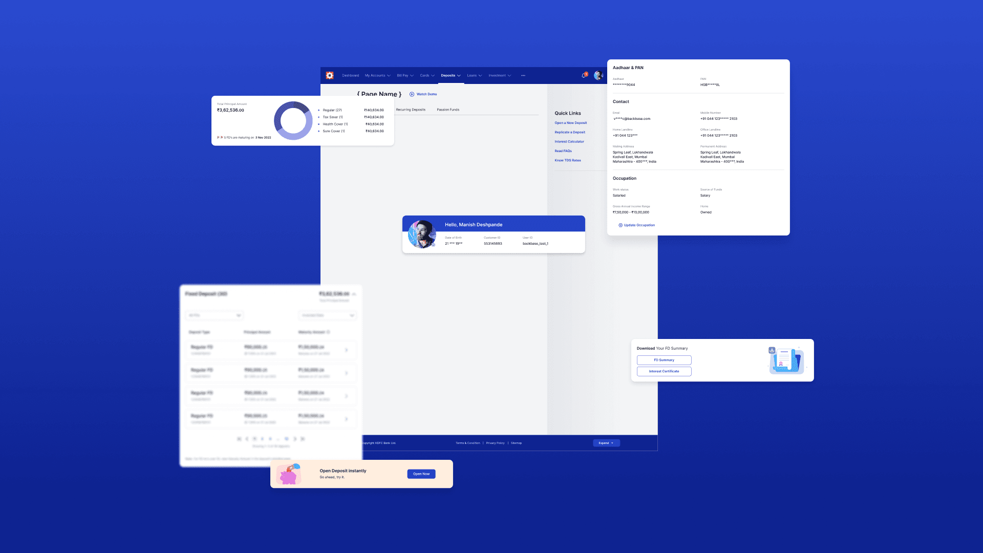
Establishing Design Patterns
Adaptable interactions that can be reused across various applications.
Establishing Design Patterns
Adaptable interactions that can be reused across various applications.
Establishing Design Patterns
Adaptable interactions that can be reused across various applications.
testing
testing
testing
testing
testing
testing
Learnings
Improved Design Consistency and Reduced Inconsistencies by 54.55% Across 8 Banking Services
Placeholder
Learnings
Improved Design Consistency and Reduced Inconsistencies by 54.55% Across 8 Banking Services
Placeholder
Learnings
Improved Design Consistency and Reduced Inconsistencies by 54.55% Across 8 Banking Services
Placeholder

Documentation Guidelines for Text Style Hierarchy and Usage
